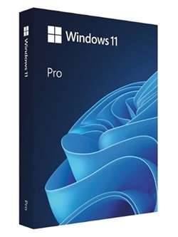
Windows 11 Pro Overview Windows 11. The main part of this announcement was supposed to be a presentation of major user interface changes codenamed Sun Valley. As you know, a significant part of the UX changes will be borrowed from the Windows 10X shell, and Windows 10X will not come to the market. Now, as expected, the Windows 11 leaks begin. Windows 11 Pro features Windows 11 will get a completely new design. Microsoft clearly needs a good reason to retract its previous claims and still abandon Windows 10 by introducing a new operating system number. And the all-new design is perfect for it. The Redmond giant has long been preparing a redesign for an update codenamed Sun Valley (“Sun Valley”) – apparently, it was under this name for Windows 11. The Sun Valley project flashed on the network for a long time – Microsoft regularly disclosed information about the new interface style, insiders shared with earlier unknown information, and popular designers in their circles developed realistic concepts based on all this data. Home and system elements will float above the bottom bar. Start is the calling card and face of every recent version of Windows. Not surprisingly, in Windows 11, the developers will change it again, but not so much in terms of functionality as in terms of visuals – the Start window will be above the bottom bar. Admittedly, these minor changes make the system look much fresher. Judging by information from the network, Microsoft will not radically change the “inside” of this menu – the updates will only affect the design of the window itself. The control panel will also float and will have the exact same design as Start. The Action Center will be combined with the control buttons together – something similar has long been used in some other operating systems. Almost all mentions of this new menu indicate that it will be an island – controls will be in one separate panel, notifications will be in another, and specific elements (like the player) in another separate panel. Right angles will disappear, replaced by fillets. Indeed, insiders and concept designers do not agree on this issue – some are sure that Microsoft will not change its traditions and keep right angles, while others are sure that in 2021 Microsoft will follow the fashion of fillets. The latter fits the definition of “All New Windows” better – hovering menus isn’t enough to make a new design truly new. Fillets are expected to affect virtually everything in the system, from context menus and system panels to all application windows. True, the opinions of concept designers differ on this issue as well – some draw fillets in all possible interface elements, others combine with right angles. There will be a transparent background with a blur everywhere. There is disagreement on the web about the style of window display islands, the design of the corners and the levitation effect of the menu, but almost everyone agrees on the transparency of the windows. Most of the leaks and design renders show transparency and blur in all windows, whether it’s at least the Start menu or Explorer. In addition, these effects are even in the assembly of the canceled Windows 10X operating system, which Microsoft developed in parallel with the Sun Valley project for devices with two screens and weak gadgets. The so-called acrylic transparency means the use of new effects when hovering over elements, as well as increased space between elements – the areas of the interface with which the user interacts will certainly become larger, and page titles will be condensed. A new font that is already displayed. Windows 11 will likely use the default responsive Segoe UI Variable font, which has already appeared in Windows 10 Build 21376 for Insiders.
- Home
- Torrent
- Windows 11 Pro 23H2 Multilingual Preactivated b22631.4037 August 2024 TPM No Torrent
Windows 11 Pro 23H2 Multilingual Preactivated b22631.4037 August 2024 TPM No Torrent
- Written by Joe Har
- on October 22, 2024
